Here is the product of about 5 minutes of photoshop. Definitely not my proudest picture, but it did teach me some of the bare basics of photoshop, so something good came out of it. It's a man inspecting a giant footprint with a magnifying glass (why he would need a magnifying glass I can't even fathom) and he's about to be stepped on by the foot that made the print.
Tomatoes and Potatoes
Tuesday, January 8, 2013
Nigel Thornberry Making Friends With a Giraffe
Today we had to make a 3D clay tile sculpture and paint it with acrylics. I couldn't resist the urge to depict the great Nigel Thornberry in his natural habitat. Here we can see him out on his daily stroll, taking film of the local wildlife, in this case a giraffe.
Ellie Elephant Living with Nessy
We recently learned how to paint landscapes, so I painted the most interesting landscape I could think of. A mountain range in Montana with a lake inhabited by the Loch Ness Monster, and an elephant peacefully grazing in the midground. The reflection of the mountains on the lake was pretty hard to do, and I think I could have done it a little bit better, but oh well. At least the elephant is cool.
Tuesday, December 11, 2012
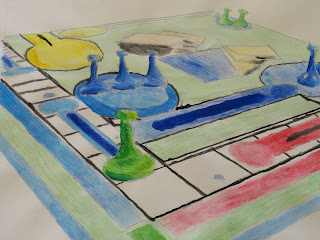
Drawing Games and Such
This. This was the project where I learned that I have no natural ability for painting. And once again I shall use all twelve vocabulary words in a single sentence. Here it goes: In order to achieve the illusion of perspective, I put two vanishing points at the far ends of the paper, on the horizon line, which set the direction that all your lines should be facing, then used watercolors which I overlapped to create washes, highlights, gradations, value, and it also helped to blend the colors together to achieve a flow to the drawing, which was emphasized by the use of colored pencils in order to create the occasional shadow. Wuddup. The final product of the project actually turned out a little better than expected, given that when I was working on this it looked like a three year old was painting it. It really drilled in to me the importance of making gradients with a mix of paint and water to achieve lighter and darker colors. I also learned to go light, because you can always make a color darker, but it's very hard/impossible to make one lighter. This was a really good introduction to the acrylic paints that we used right after we completed this project. (which were still pretty darn hard to use) If I could do this project over again, I would definitely not paint it. If I have the option, I will always choose to draw, rather than paint, or some other medium. Regardless, (not irregardless. When I'm president, anyone who uses irregarless will be sent to a work camp) this project was a good learning experience, and kind of a crash course on how to use paint properly.
Monday, November 19, 2012
Oh, How The Amish Smile
We first found a picture of something (I chose a happy amish man) and then we put it into photoshop and transformed the scale and perspective of the picture, and then made a grid to make the task of drawing the picture out of perspective easier, and then we used colored pencils to give it a shadow, and some value, which adds that extra level of interest everyone seems to like. Yet another example of how awesome I am at using all the vocabulary words in a single sentence. The point of this project is to take a picture and make it look really stretched out and awkward when you look at it straight on, but when you look at the right angle, it looks like it's coming off the page. So in conclusion, we found a picture, stretched it out, then drew it using a grid method so it looks like it's popping off the page when viewed at the right angle.
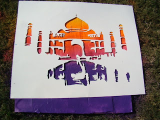
The Taj Mahal Crawl
This stencil used positive and negative space which created a stark contrast that was highlighted by the brightly colored spray paint we used that made up the composition of the portrait, and had interest added to it by the collage in the background, on top of which was our drawing that we cut out with an Xacto knife from a page that we printed off of photoshop, where we used the threshold tool to help us see the contrast. Boom. Every vocabulary word used in one sentence. I used the background colors in order to create an illusion of a sun setting in the late afternoon, plus it looks pretty cool. The Taj Mahal itself is silouhetted against the sun, and the white part is it's reflection on water. I almost cut my arm off about six times while using the Xacto knife, but it's all good because I'm prepared to make those kinds of sacrifices for my art. I loved the spray painting part of the project, and am thinking about making another stencil to put on other places around town. But not really because that's illegal, but it'd still be pretty sweet. This has probably been my favorite project we've done yet, both in the finished product, and the process of making it.
Subscribe to:
Posts (Atom)


