Monday, October 22, 2012

Harold Transcends Into His Final Form


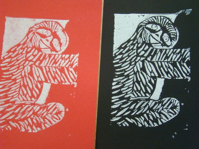
We finished the prints and here is my sloth in all its glory. He's desperately clinging on to a tree, but somehow still manages to crack a smile, the little trooper. I tried to cut the texture so that it made you start looking at the head, then the fur flowed down all throughout his body, finally ending at the ends of the feet, all uniting the whole sloth. We'll call him Harold, because I'm getting tired of calling him an it, or a sloth. Harold's fur adds interest to the whole picture, and just adds a new dimension that makes the picture more enjoyable to look at. Pretty much any space that isn't positive, is negative. This sounds like a given, but it's difficult to think about when you're designing the print. You have to think in a whole new way to work with how to make a stamp. It took an extremely long time to try to cut and define all of Harold's fur, because all the black or orange that you see is cut out. I had to basically cut out everything and just leave islands. The craftsmanship could have been a little bit better, I didn't realize how deeply you had to cut in order to make it so that the ink showed where you wanted to.It was difficult to make a detailed depiction of the background due to the size of the block of linocut that we had to work with. Harold was originally going to be an arctic sloth, but the background had to be drastically simplified to the point where you can just assume he's holding onto a tree. The project was a success, although it was frustrating trying to learn how to use the cutting tools proficiently, however, after you take away the stamp and see your final print, it's cool to see the finished product and how much of a contrast there is.

Thursday, October 4, 2012

How to Carve A Sloth


     This week we've been hard at work making stamps. We start out choosing an animal and drawing it, then we transfer that drawing to a different page and add a texture that would be condusive to the overall stamp design. The picture that is attached to this post is that step in progress. It looks much more like a sloth now, I promise. I refined the texture to make it look more like fur, and less like cuts along his back and stomach. Unfortunately, we don't have a picture of the current design that I can post, so this will have to satisfy. After we transfer the picture to finalize the stamp design, we then transfer the refined version onto a strip of eraser-like material called linocut. After that's done, we take these strange scoop-scalpels and carve out our design so that when you put the linocut in ink and press it onto paper our design comes out. In this project, the texture is essential, because it makes the animal that much more clear, and adds interest to the overall design. It's also a good way to practice drawing different textures for different animals. I chose three possible animals for this project: a sloth, kangaroo, and water buffalo. I had to draw each with a different background in order to tell which one is best. The sloth here is supposed to be in an arctic background, clinging onto an icicle, however the size of the stamp prohibited high detail of the background. The project is still in progress, but I think it will turn out well, so long as I don't make any mistakes while carving out the linocut.

Venturing Into the T.A.R.D.I.S


     For our interactive chalk mural, we decided to pay tribute to Doctor Who and we drew the T.A.R.D.I.S. The scene is supposed to be so that you can take a picture of yourself walking into the T.A.R.D.I.S. Working on a team was a challenge, new to my average solitary art experience. It was nice having inspiration coming from sources other than my own imagination. It really added to the ingenuity of the final product. As the saying goes, "two heads are better than one", or in this case, five or six heads.While the creative advantages were great, it was a tad difficult to explain my own ideas, and explain why it would add to the mural, however other people's input did make the decision of whether or not an idea was a good one go much quicker.Overall, this project was a success in that our final product turned out quite well, even if we hit some speed bumps along the way. The perspective lines of our picture were a bit crooked in places, but from a distance, it's quite a sight to behold. Interactive art is a whole new genre that is virtually untapped. It brings up a swath of challenges that you must overcome, but the final product is breathtaking if you can do it right. The possibilities for this style are limitless, and I'm proud to have been a part of making an interactive mural.