Tuesday, December 11, 2012

Drawing Games and Such


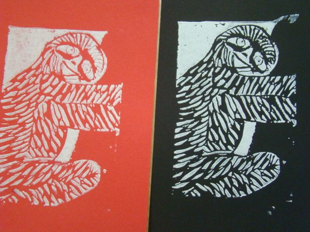
This. This was the project where I learned that I have no natural ability for painting. And once again I shall use all twelve vocabulary words in a single sentence. Here it goes: In order to achieve the illusion of perspective, I put two vanishing points at the far ends of the paper, on the horizon line, which set the direction that all your lines should be facing, then used watercolors which I overlapped to create washes, highlights, gradations, value, and it also helped to blend the colors together to achieve a flow to the drawing, which was emphasized by the use of colored pencils in order to create the occasional shadow. Wuddup. The final product of the project actually turned out a little better than expected, given that when I was working on this it looked like a three year old was painting it. It really drilled in to me the importance of making gradients with a mix of paint and water to achieve lighter and darker colors. I also learned to go light, because you can always make a color darker, but it's very hard/impossible to make one lighter. This was a really good introduction to the acrylic paints that we used right after we completed this project. (which were still pretty darn hard to use) If I could do this project over again, I would definitely not paint it. If I have the option, I will always choose to draw, rather than paint, or some other medium. Regardless, (not irregardless. When I'm president, anyone who uses irregarless will be sent to a work camp) this project was a good learning experience, and kind of a crash course on how to use paint properly.

Monday, November 19, 2012

Oh, How The Amish Smile


We first found a picture of something (I chose a happy amish man) and then we put it into photoshop and transformed the scale and perspective of the picture, and then made a grid to make the task of drawing the picture out of perspective easier, and then we used colored pencils to give it a shadow, and some value, which adds that extra level of interest everyone seems to like. Yet another example of how awesome I am at using all the vocabulary words in a single sentence. The point of this project is to take a picture and make it look really stretched out and awkward when you look at it straight on, but when you look at the right angle, it looks like it's coming off the page. So in conclusion, we found a picture, stretched it out, then drew it using a grid method so it looks like it's popping off the page when viewed at the right angle.

The Taj Mahal Crawl


This stencil used positive and negative space which created a stark contrast that was highlighted by the brightly colored spray paint we used that made up the composition of the portrait, and had interest added to it by the collage in the background, on top of which was our drawing that we cut out with an Xacto knife from a page that we printed off of photoshop, where we used the threshold tool to help us see the contrast. Boom. Every vocabulary word used in one sentence. I used the background colors in order to create an illusion of a sun setting in the late afternoon, plus it looks pretty cool. The Taj Mahal itself is silouhetted against the sun, and  the white part is it's reflection on water. I almost cut my arm off about six times while using the Xacto knife, but it's all good because I'm prepared to make those kinds of sacrifices for my art. I loved the spray painting part of the project, and am thinking about making another stencil to put on other places around town. But not really because that's illegal, but it'd still be pretty sweet. This has probably been my favorite project we've done yet, both in the finished product, and the process of making it.

Monday, October 22, 2012

Harold Transcends Into His Final Form


We finished the prints and here is my sloth in all its glory. He's desperately clinging on to a tree, but somehow still manages to crack a smile, the little trooper. I tried to cut the texture so that it made you start looking at the head, then the fur flowed down all throughout his body, finally ending at the ends of the feet, all uniting the whole sloth. We'll call him Harold, because I'm getting tired of calling him an it, or a sloth. Harold's fur adds interest to the whole picture, and just adds a new dimension that makes the picture more enjoyable to look at. Pretty much any space that isn't positive, is negative. This sounds like a given, but it's difficult to think about when you're designing the print. You have to think in a whole new way to work with how to make a stamp. It took an extremely long time to try to cut and define all of Harold's fur, because all the black or orange that you see is cut out. I had to basically cut out everything and just leave islands. The craftsmanship could have been a little bit better, I didn't realize how deeply you had to cut in order to make it so that the ink showed where you wanted to.It was difficult to make a detailed depiction of the background due to the size of the block of linocut that we had to work with. Harold was originally going to be an arctic sloth, but the background had to be drastically simplified to the point where you can just assume he's holding onto a tree. The project was a success, although it was frustrating trying to learn how to use the cutting tools proficiently, however, after you take away the stamp and see your final print, it's cool to see the finished product and how much of a contrast there is.

Thursday, October 4, 2012

How to Carve A Sloth


     This week we've been hard at work making stamps. We start out choosing an animal and drawing it, then we transfer that drawing to a different page and add a texture that would be condusive to the overall stamp design. The picture that is attached to this post is that step in progress. It looks much more like a sloth now, I promise. I refined the texture to make it look more like fur, and less like cuts along his back and stomach. Unfortunately, we don't have a picture of the current design that I can post, so this will have to satisfy. After we transfer the picture to finalize the stamp design, we then transfer the refined version onto a strip of eraser-like material called linocut. After that's done, we take these strange scoop-scalpels and carve out our design so that when you put the linocut in ink and press it onto paper our design comes out. In this project, the texture is essential, because it makes the animal that much more clear, and adds interest to the overall design. It's also a good way to practice drawing different textures for different animals. I chose three possible animals for this project: a sloth, kangaroo, and water buffalo. I had to draw each with a different background in order to tell which one is best. The sloth here is supposed to be in an arctic background, clinging onto an icicle, however the size of the stamp prohibited high detail of the background. The project is still in progress, but I think it will turn out well, so long as I don't make any mistakes while carving out the linocut.

Venturing Into the T.A.R.D.I.S


     For our interactive chalk mural, we decided to pay tribute to Doctor Who and we drew the T.A.R.D.I.S. The scene is supposed to be so that you can take a picture of yourself walking into the T.A.R.D.I.S. Working on a team was a challenge, new to my average solitary art experience. It was nice having inspiration coming from sources other than my own imagination. It really added to the ingenuity of the final product. As the saying goes, "two heads are better than one", or in this case, five or six heads.While the creative advantages were great, it was a tad difficult to explain my own ideas, and explain why it would add to the mural, however other people's input did make the decision of whether or not an idea was a good one go much quicker.Overall, this project was a success in that our final product turned out quite well, even if we hit some speed bumps along the way. The perspective lines of our picture were a bit crooked in places, but from a distance, it's quite a sight to behold. Interactive art is a whole new genre that is virtually untapped. It brings up a swath of challenges that you must overcome, but the final product is breathtaking if you can do it right. The possibilities for this style are limitless, and I'm proud to have been a part of making an interactive mural.

Friday, September 21, 2012

Drawing A Random Guy


In order to complete this project, we first had to take a picture of ourselves and give them to a fellow classmate. The pictures were taken with a projector to our right in order to ensure a sharp contrast of colors. We then held our pictures up to a window or other source of light, and put tracing paper over them, then we traced any shapes we saw Be it a shadow, or facial feature, we had to trace as many shapes as we possibly could. We then did the process of transferring our tracings on the tracing paper to our sketchbooks, retracing every line until we had the exact same drawing in our sketchbooks. Tracing all of the shapes allowed us to see where every shadow and color gradient started and stopped. We achieved a full range of different values in our portraits thanks to the positioning of the projector when we were first taking the photographs. This made the differences between the shades very harsh, and extremely noticeable. My execution of the drawing could have been better. I think I could have shaded darker, and maybe cleaned up the edges a little more. I'm still not happy with the way the eyes turned out, but I couldn't think of how I could have made them more like the actual person's. Then there are all the random smudges around the paper that come with rubbing the drawing with your fingers in order to have real looking shading. I had to overcome the obstacle of having never done a portrait of this nature, and using all new techniques, but overall I think the finished product was a success, and I had a fun time completing the portrait.


-Jack

Thursday, September 6, 2012

Moss Graffiti


This project was really fun, however I think it could have gone better if I had more refined painting skills. My goal was to paint a silouhette of the world, with the continents being moss, while the oceans are just the actaul wall. This way, when the moss grows, it looks like every inch of land on the earth is covered in trees, and like we have a green Earth. Unfortunately, the tragic flaw in this plan is that my painting skills are rudimentary at best, so the continents just kind of look like blobs, vaguely representing the land mass that they're supposed to be. I think I got the main idea across, however, and so the project was an overall success.

Skips' Skeleton


I feel that this project was a success in that it strengthened my understanding of how to properly draw a skeleton. The final product of this project was a success. I put several different techniques that I learned previously in this class to use, and the combination of these techniques made a drawing that turned out quite well. If I were to re-do this project, I would have exaggerated the character's bone structure more in order to better compliment his abnormal body. I struggled with making Skips' rib cage because it needed to be the correct shape, and with a realistic number of bones, all connecting in the proper places. The overall idea of this project is great, it was fun to draw what we think a cartoon character's skeleton looks like, and at the same time it taught us how to better draw a human one.